Journal
My letterpress day - part one
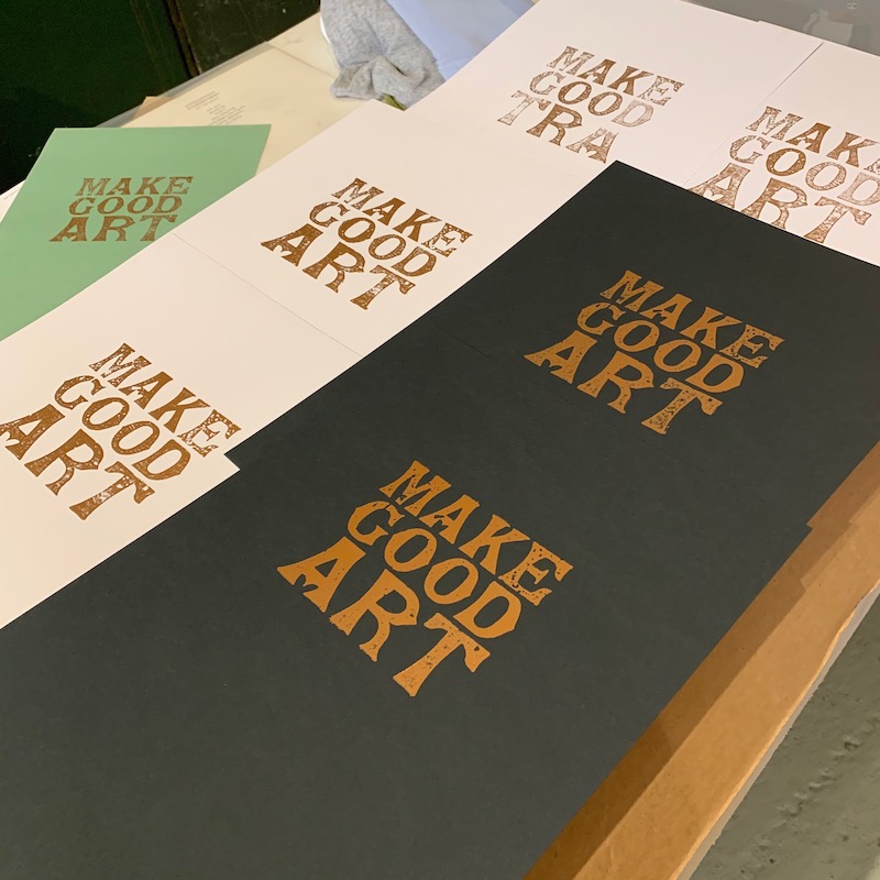
Or: how I spent an entire morning working on three words.
Images in this blog post are courtesy of Dulcie, Mostly Flat.
We saw yesterday that letterpress is a slow process - but would you believe that a simple three word layout took two and a half hours to do?
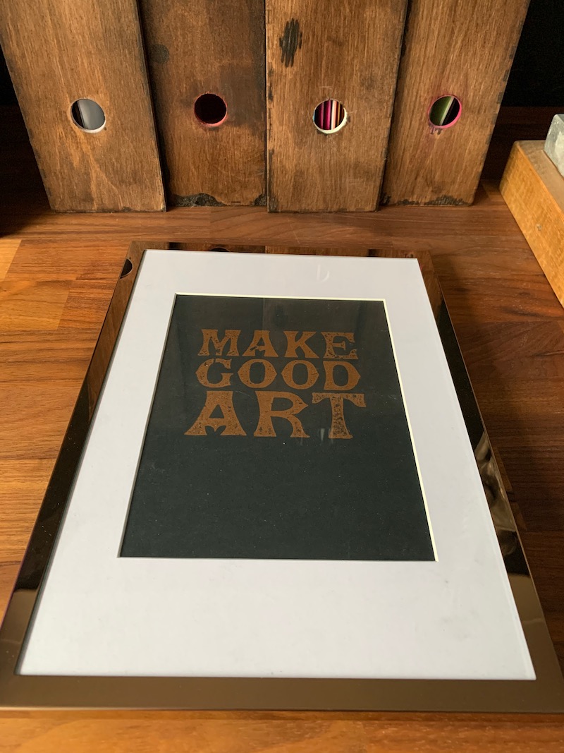
Look at the 'Make Good Art' print that you see below. I had picked the words from a speech by Neil Gaiman (also available as a book), and I already had a vague idea for the layout you see here. I figured that two four letter words and a three letter word lent themselves to this sort of arrangement, that I'd obviously need pretty large letters, and that with the overall idea being so minimalist the font would be important. But with letterpress you can't just download a new font, you're limited to what you have on hand.
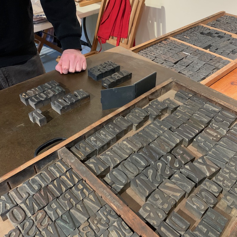
So together we sifted through a few drawers looking for a typeface I liked, that was also available in the right combination of sizes. Once that was decided on, we pulled out the letters we needed, and checked to see that they weren't badly damaged or worn. It's worth noting that as antique items they're never going to be perfect - most of the imperfections you see in the print, particularly the patches inside the letter outlines are from the natural aging of the wooden blocks the letters are carved from.
Then we had to measure their height, so that they all aligned properly when pressed against the paper - if one is lower than the others it might not transfer as much ink, or none at all. After gently gluing paper to the back of the shorter letters we were ready to align them. Some of the letters looked closer together than others, due to their shape, so a few more paper shims took care of that. Then we had to lock the letters together in a frame, picking the right combinations of wooden blocks, metal shims and locking bolts to ensure nothing wobbled.
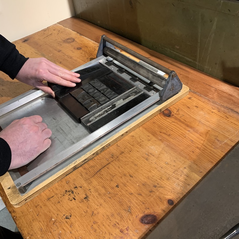
There's an art to this also - if you tighten things up too much then they can flex and fail to print evenly, if you tighten them too little then they wobble or even fall out. Any movement in the blocks will lead to a smear or smudge on the print, so you want everything pretty solid.
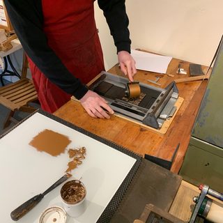
Then it was time to pick an ink and paper combination. Some letterpress ink is rubber based, some is oil based, and each variant can come in a variety of shades even before you mix them. Some are metallic, some glossy or matte, and they all interact differently with the paper - I was quickly learning that even the basics of letterpress were going to involve a lot more than could fit into a short workshop!
Fortunately Dulcie has a wide variety of previous work to look through, to give an idea of some of the options available (and in fact my work is now part of that library for future workshop attendees to learn from) so we could pick something I liked the look of as a starting point and make small changes from that.
I decided on a copper metallic ink on black paper, and after a short discussion of which ink would work best, which paper stock and size, we were ready to put the first ink onto the blocks only 90 minutes after starting! 3 words in an hour and a half is definitely slow going (someone with a copy of MS Word could have done it in a fraction of the time) but it was never boring, something about pondering each decision and making informed choices felt more real that the usual 'try a dozen things and pick a favourite' method we're used to with computers.
Since we were printing something on A4 sized paper, we didn't have the option of using the Adana presses (they can handle up to 8 x 5 inches) or the treadle press for this - and in fact wood blocks lend themselves bvest to what's called a 'galley press'. Basically this is a shallow tray that you lock the wood into, which has a roller with a handle built into the frame. Once the blocks are locked in place, you ink them up with a hand-roller, carefully place the paper on top and lock it into place with a clip, and pull the handle down towards you. If all goes well, the roller presses the paper against the inky blocks, you get a nice clear print and you can carefully lift it away from the press and let it dry.
The first few times were not entirely successful (although better than I expected) - there's an art to placing and lifting the paper without moving it at all, a knack to pulling the roller over so that it doesn't stop part-way and it's very hard to judge how much ink is enough without a lot of practice. Early on I had too little and the letters looked blotchy. Later I had too much and you noticed raised ridges along the edges where the ink had squeezed out. I finally got it right and then tried to reproduce that for about a dozen prints.
By the time I'd done the last one, we had been going without a break for two and a half hours - though I felt it was closer to an hour! We broke for lunch, and in the afternoon set to work on a more ambitious project... but that's coming in the next blog post.
To book a workshop of your own, contact Dulcie, details are on her website.