Journal
My letterpress day - part two

Or: how to complicate things with a simple decision.
Images in this blog post are courtesy of Dulcie, Mostly Flat.
In the previous post we saw how I worked with wood-block type to produce a poster-style print.
After lunch it was on to the more typical lead type (actually a mix of lead, antimony and tin, which melts at a lower temperature than lead alone). I had picked a phrase from my upcoming novel to set, and we looked through a number of font samples for one that suited the phrase and the overall design idea I had in mind. I narrowed the list down to a couple of samples, selected an appropriate size and then it was back to the type drawers to find which one had all the letters we needed.
A word on names, here - the 'drawers' are actually called 'cases' - and typically the small letters sit in the lower case, and the capitals in the upper one - hence upper and lower case. Printing is also where we get the phrases 'mind your p's and q's' (since they look like each other when reversed) among many others.
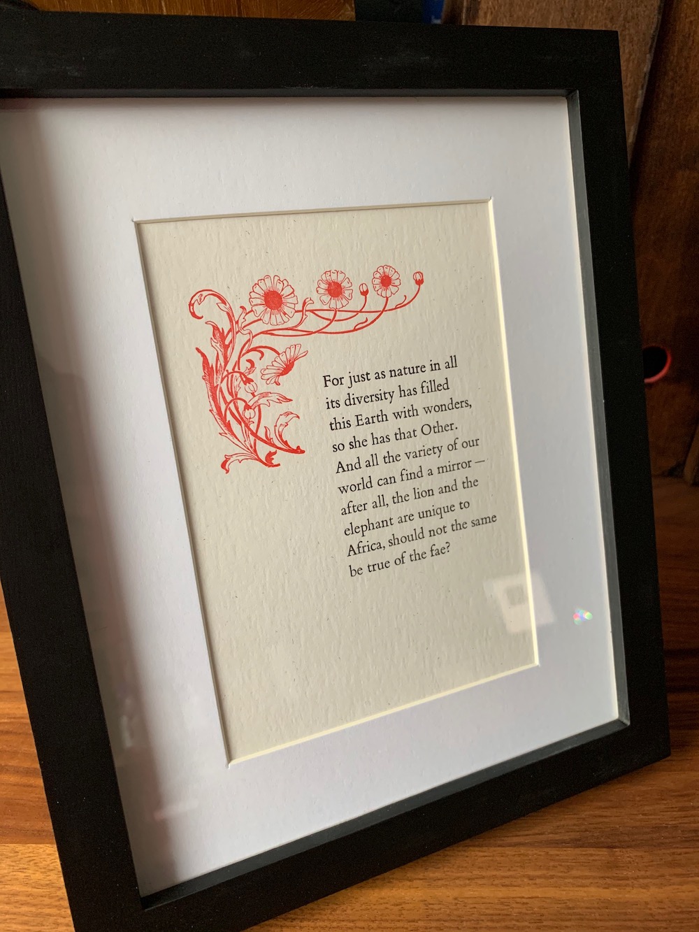
With that all decided on, we could judge the size of the finished block, work out where the line breaks needed to be, and consider the final page size we'd need to make it all look good. I picked something approximately the size and shape of a book page, which felt appropriate, but since it was a short sample of text there was a lot of white space. Over lunch we'd discussed the option of an ornament of some sort, and I figured something floral might work with the theme of nature in the text itself. You can see how many decisions need to be made before you can really get going.
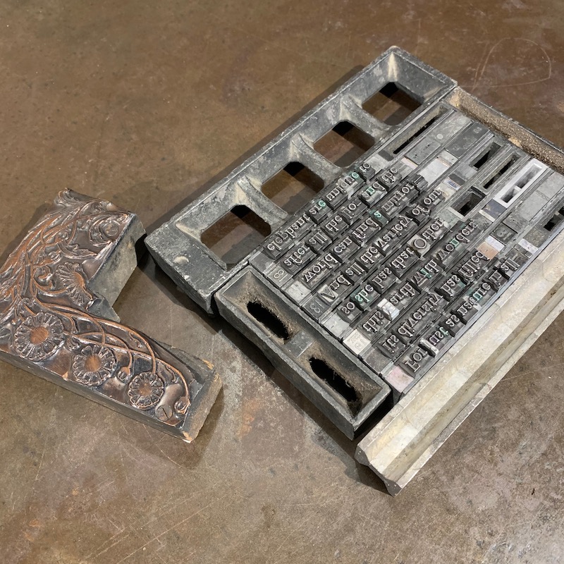
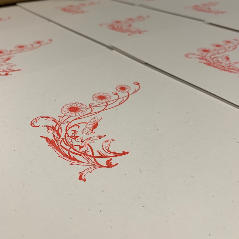
Dulcie had a wide variety of ornaments to choose from, but in fact it was the first one she pulled from a drawer that spoke to me most. It had a certain vintage look that suited the purpose (in the novel the writer of those words is a bookbinder, the lead character's Grandfather, so this looked like something he might even have produced himself). Deciding on red ink instead of the more obvious green to emphasise the other-worldy aspects subtly proved a good choice. However, as you will see later printing two colours is a much more complex process than might be thought. Dulcie informed me that this was a block (made up of a copper design screwed to a wooden form) she'd never got round to printing herself, so she was as curious to see how it turned out as I was!
But first I had to set the text. While Dulcie set to work levelling the ornament block to align it with the height of the type, I stood with a setting stick in my hand picking the appropriate letters from the case, constructing each line one fiddly little metal piece at a time. You start at the beginning of the written text, but the letters are placed into the stick upside down as you build the whole page line by line. The case isn't in alphabetical order, by the way - frequently used letters are nearer the centre so you need to move your hand less to find them. It took a while to track down a 'q' for example, but after a surprisingly short time I was able to grab an 'e' without needing to check the map.
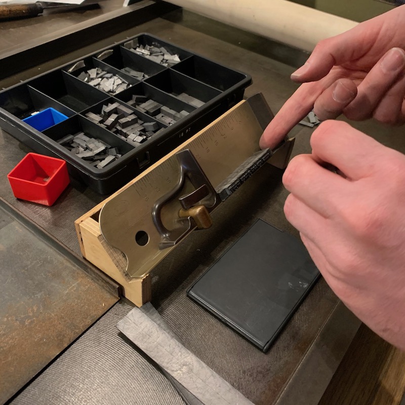
This is where I expected to get frustrated - I'm not the most patient of people by nature, and lack a certain amount of manual dexterity, so expected this to be my least favourite part of the process. In fact, I loved it! Once I got the knack of slotting the letters into place and pinning them down with my thumb it flowed very smoothly, and as I mentioned in the first post I lost track of time entirely due to the meditative nature of it all. The only frustration came when trying to shim each line to ensure it didn't wobble - every piece of filler I tried was ever-so-slightly too wide or too narrow but by the end I was getting better at picking out the right pieces.
Each four lines I set needed to be transferred to a stone, which served as a perfect flat surface while we aligned them all - something that needs steady hands and a certain technique as you lever out the set block and slide it from the stick to the stone. If you lift the type up or jostle it, you can un-set everything and have to start over. Luckily we had no hiccups and soon the ten lines of text were safely positioned and bolstered with weights each side to hold them in place temporarily.
But we couldn't print them yet - because I'd elected to use two colours we needed to think the process through carefully. If you print the black text first, you need to clean the press entirely of ink before you can print anything else, which slows you down. So you need to print the lighter colours first, then if you're lucky you can mix the darker colour in and save yourself a lot of time. Since we were going to print the text in black, we were confident it would override the red and look just fine.
So we set to work printing the ornament. For this we used a gorgeous treadle press, a wonderful clanking apparatus driven by a foot pedal and a heavy flywheel which inks the print block and presses the paper against it perfectly repeatably.
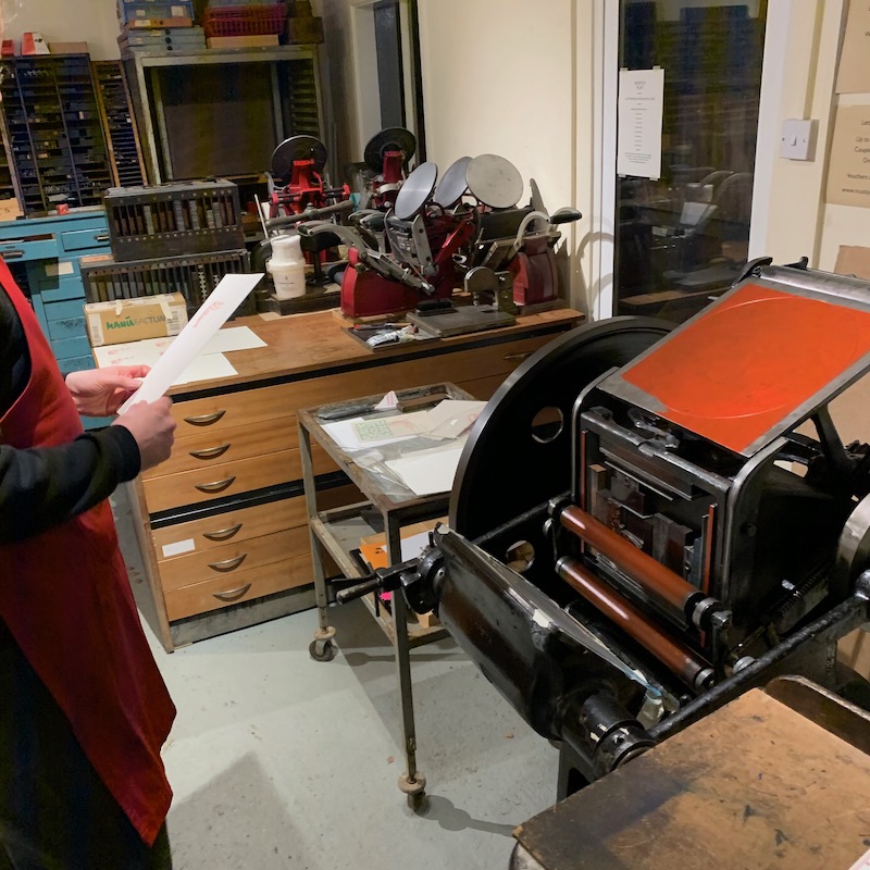
However once we got our ornament into the press we found that the top third was barely registering an impression, while the bottom was perhaps pushing too deep. We therefore had to adjust the packing behind the paper tray to get what we wanted - torn up pages of the phone book were a good thickness, it turned out, and it was nice to put it to use! Fragments were packed in behind the paper exactly where it was needed to form a good impression and we ran through quite a few test pages on scrap paper to ensure we were happy with the result.
Then it was time to use the real paper - a lovely oatmeal paper which had such gorgeous texture it's a shame to lock it under glass. We ran off at least a dozen of these and each was just a beautiful as the last.
While they dried a little we locked the text block into the frame and re-inked with black ink - the first test print came out purple but after that the black looked perfect. Here's where we had some work to do though - aligning the text block perfectly. We'd done our best to lock the letters where we thought they needed to be, but we were about a half-inch off. The 'proper' way to do things is to take out the text block, move it in the frame, relock it and try again - but since it was already getting late I decided to just re-align the paper in the press instead. Normally you wouldn't do this as it's too easy to skew the paper and end up with a wonky print, but since the ornament wasn't perfectly square itself we had a little flexibility. A couple more test prints got us to where we were happy and I set to work.
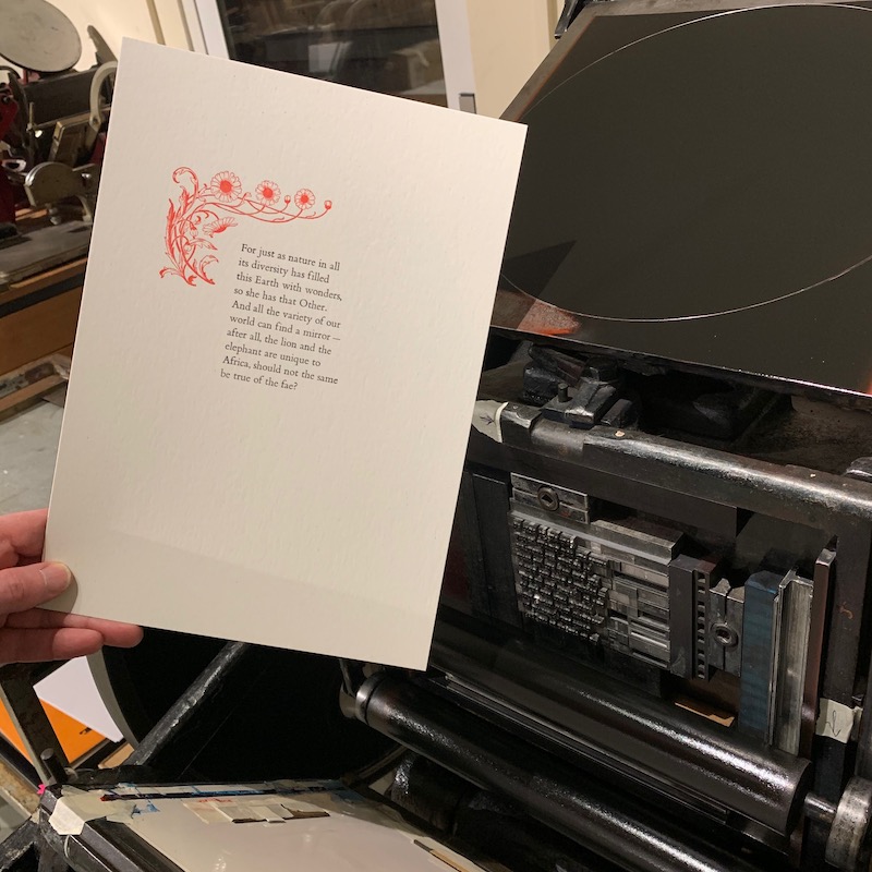
I hope you agree the end result was worth the effort - I'm thrilled with it! It took about four and a half hours in total, and there's no way I could have done it even in that time without Dulcie's undivided attention, so it was fortunate I was on a one-to-one course. I now have a great selection of both prints to use as gifts, as well as a couple that I've framed and will hang in my office as both inspiration and a reminder of a wonderful day out.
To book a workshop of your own, contact Dulcie, details are on her website.