Journal
Making an Impression

I spent a day in a letterpress studio, learning the intricate art of printing with movable type.
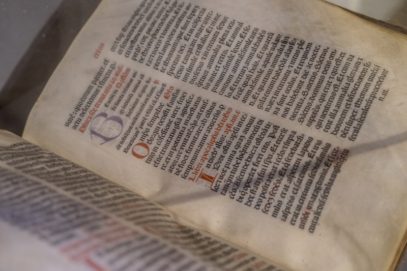
Back when writing was new, every copy of a document was written by hand. You can picture a room full of monks painstakingly copying out bibles by candlelight, perfect handwriting and gorgeous illuminated letters.

Obviously this was a slow process, prone to errors and requiring a lot of people to produce books. For this reason, the printed page was extremely expensive, and often the only book the average person saw would be the Bible in church, which they'd never be allowed to read from even if they were literate.
But then in 1450 Johannes Gutenberg introduced a device that was able to take blocks of text made up of small, cast lead letters arranged however you wanted and print them onto paper. A skilled worker could arrange these letters more rapidly than a monk could write, and once the page was set up a new copy could be produced in seconds - it's estimated that in the first 50 years after this invention, more books were created than in the previous 1200 years!
Nowadays I can alter the arrangement of this blog page in moments; I can switch fonts in an instant and see whether I like it better. But there's still a few aficionados of 'movable type', and I spent the day learning the basics from Dulcie Fulton of Mostly Flat
Dulcie runs workshops in her studio on the border of Hereford and Shropshire, where you can join a group of other people or just a couple of friends for the day and learn the basics - and come away with something you created yourself. Or if you prefer she will also run a one-to-one workshop day, where you get her undivided attention while you work on something more complicated. This is what I went for, and in fact I was able to produce two designs by the end of the day.
Unlike modern typesetting (all that fiddling with fonts and margins you do in Word), with letterpress you need to start with the end result in mind. If you decide you don't like a particular font after you've set a page of text, you have to start over! If you want the text slightly narrower on the page, you can't just alter a margin, you need to physically move the type letters around. And if you spot a misspelled word in the middle of a line, you'd better be handy with the tweezers...
So it's very important to plan up front - I arrived with the text I wanted to set already in mind, but only a vague idea of the finished result I was after (design isn't my strong suit). Fortunately Dulcie is a very talented graphic designer, and happily advised me on what to consider to ensure I ended up with a great piece of work to take home. At no point did she take over; I was always in control of the end result but with her advice I definitely ended up with a better print. If you book a workshop do read the email she'll send you, as it guides you through a very small amount of preparation which will ensure you get the most out of the day.
I'll go over the finer details of the printing process in upcoming posts, but Dulcie guided me through the stages at a perfect pace, explaining why we did something in a particular way rather than just telling me what the next step was, and she was happy to answer questions as they came up. She's a very patient teacher (patience is something you need when working with letterpress) and you won't get any lengthy lectures, I was hands-on throughout!
The day flew past; something about the typesetting process taps into that meditative part of the mind. When picking out and arranging the letters you're concentrating of course, but also the repetition of motion allows the mind to wander and I often caught myself idly speculating about what previous arrangement the letters I was using had been set in. At one point I realised two hours had passed and I had eight lines of text in front of me, with no clear memory of arranging them. Fortunately only one letter was upside down!
All in all it's a fascinating process. I felt in touch with a bygone age, an impression emphasised by the age of a lot of the equipment. The presses are solid cast-iron and will probably last forever, the type is antique but very well cared for, and the fact that I had no phone signal meant there were no modern distractions at all. Discovering I was using an ink roller formerly owned by the poet Ted Hughes was just the icing on the cake.
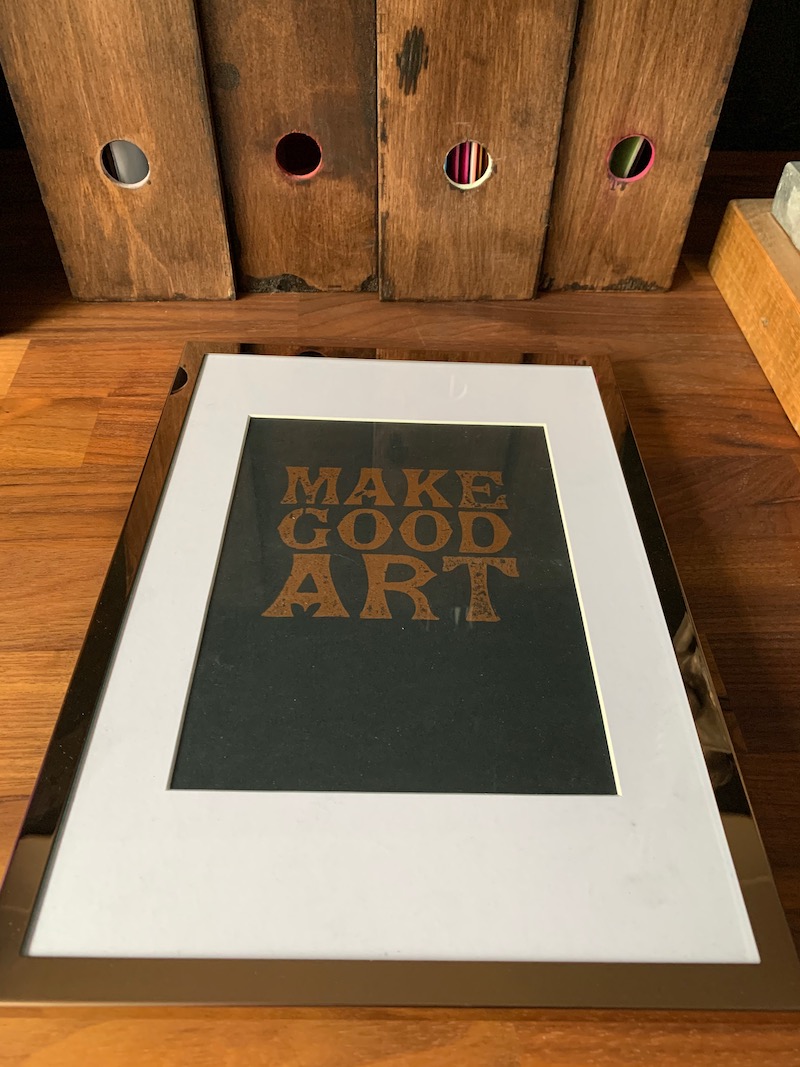
I'm delighted with the work I created - one piece is shown below, the other will be revealed shortly on my Instagram. I was able to print about a dozen copies of each and it's fascinating to see the minor differences between them as a result of such an analogue process. While the treadle press I used in the afternoon lends itself to repeatable results by virtue of its mechanism, the 'Make Good Art' print (thanks Neil Gaiman for those words) was hand-inked and so every one is unique.
I absolutely recommend you book a workshop with Dulcie, details are on her website. She also takes commissions and sells a range of products including gift vouchers if you want to gift someone a workshop for a special occasion. You even get a lunch at Aardvark Books around the corner - delicious, but you will leave there with armfuls of amazing books!
Thanks to Dulcie for a remarkable day, an experience I shall cherish and hope to repeat as soon as possible.
